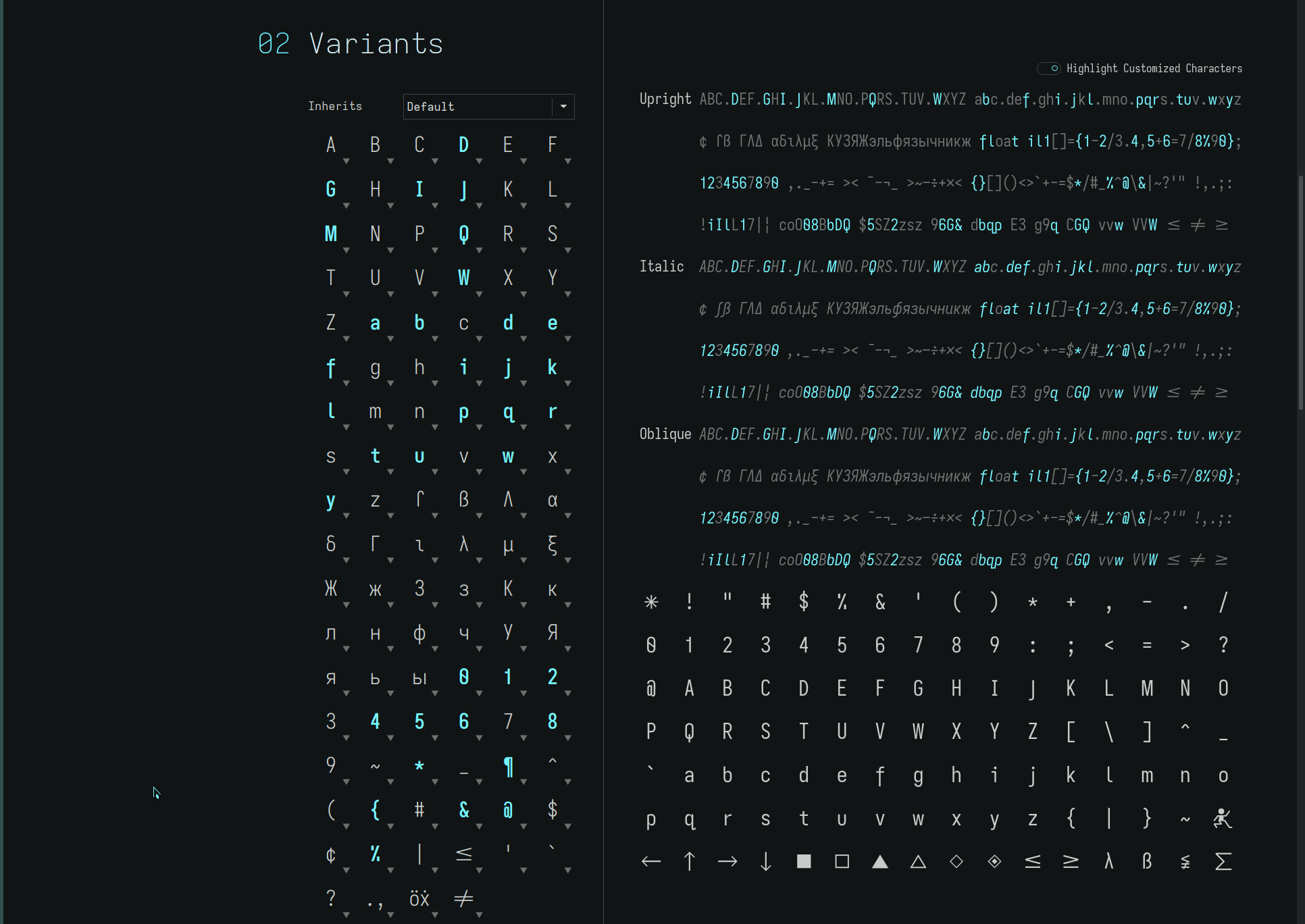
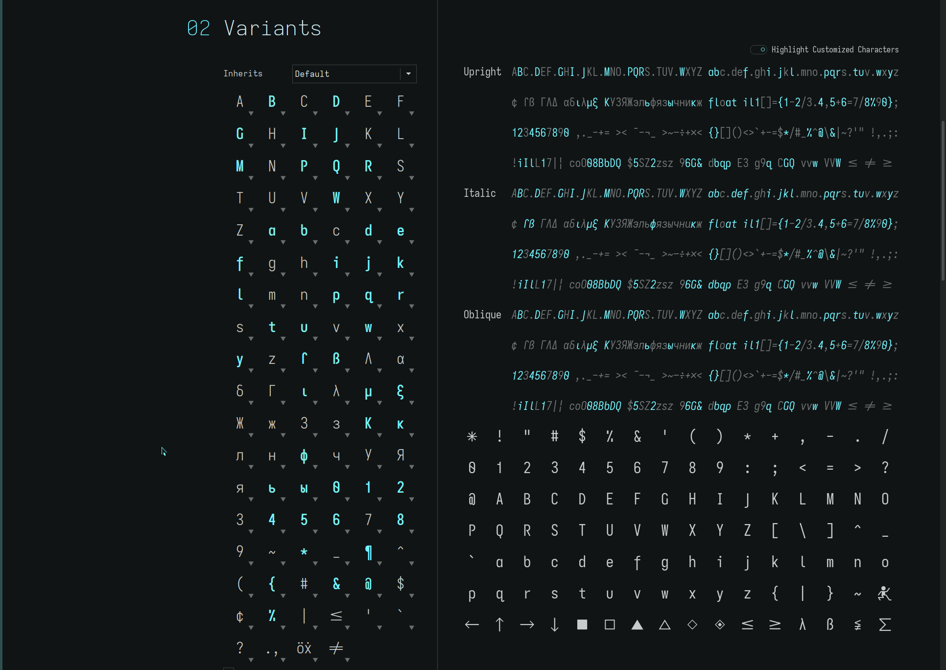
dyslexic variations
among other things, this is an attempt to normalize the various MonoLexic fonts created on this site, removing redundant alias font naming and, instead, assigning custom Space cell widths to those font names—i still harbour a fondness for those names :)
geolexic
is now assigned to the former elementary font in honour of geometric fonts such as Futura with their distinctive single storey lower case a. The *Lexic postfix name now consistently represents dyslexic fonts with a double cell width Space separator for maximal word separation. And Grotesk is no longer an alias for Unolexic, yielding..
| font* | b-d-p-q | f | a | space |
|---|---|---|---|---|
| Monolexic | round-serifless-corner-hook | flat | double | 2x |
| Unolexic | round-serifless-corner-hook | extended | double | 2x |
| grotesk | round-serifless-corner-hook | extended | double | 1.6667x |
| Geolexic | round-serifless-corner-hook | flat | single | 2x |
| elementary | round-serifless-corner-hook | flat | single | 1.6667x |
*An “i” prefix to the font names designate font sets with a serifed capital I (see fonts).
word separation
Why the new elementary and grotesk fonts?
After considerable time on my ereaders with the 2x Space cell width dyslexic fonts, i found for myself, that a slightly narrower cell width spacing maintained adequate word separation with a slight increase in reading (scan) speed—along with a visually appealing page density.
The full page columnar alignment is lost by the partial word spacing reduction—the visual benefit of which, appears to be dependent on one’s spatial predisposition.
i originally thought it beneficial to have a columnar—vertical letter alignment—layout for the visual cortex to absorb in full but now i am uncertain whether unaligned “noise”—non-vertical letter alignment—may be less distracting to the visual center. No doubt, people will be found in both camps.
Responses from the community who have found the original dyslexic spacing beneficial, still appear to prefer the 2x spacing—the neural parameters being very individual. i may be the outlier here :)
single storey a
Interestingly, while the double storey lower case a is the more legible of its lower case representations, i have been finding myself drawn to elementary as my default ereader font. At 300PPI, it renders clearly and distinctly (for my eye sight) and i like the increased air the open glyph presents on the printed line.
For web browsers and computer monitors, the double storey glyph still looks more legible to my eyes. This is largely a function of PPI and current browser font rendering—this opinion may change tomorrow.
It is these personal aesthetics that create the beautiful typeface variations available to us. Whatever works for you :)
even tighter
after acclimating to the 1.6667x cell width Space character and finding it quite agreeable, i revisited a 1.5x cell width which i previously discarded at the time—finding the jump too jarring after a lengthy tenure with the default 2x Space character.
To my surprise, this no longer seemed out of place (for me—i still recommend the default 2x Space character for maximal dyslexic benefit). This cell width staggers the columnar format of the page with a high degree of vertical character alignment along with increased page density.
Taking this further, a 1.3333x cell width provides an even more familiar visual page density while still retaining a wider Space cell width than other fonts. For those seeking maximum legibility and word density who do not require the extra dyslexic word separation, this setting may fit the bill.
So there are now several word spacing options available in the repos..
| font | b-d-p-q | f | a | space |
|---|---|---|---|---|
| Unolexic | round-serifless-corner-hook | extended | double | 2x |
| grotesk | round-serifless-corner-hook | extended | double | 1.6667x, 1.5x, 1.3333x |
| Geolexic | round-serifless-corner-hook | flat | single | 2x |
| elementary | round-serifless-corner-hook | flat | single | 1.6667x, 1.5x, 1.3333x |
capital q’s
two more capital Q glyph variants have been added to the elementary and grotesk font families..
- a capital Q with a vertical-crossing stroke—the crossing stroke closing the glyph somewhat (making it appear narrower and longer) and imparting a symmetric profile to the glyph
- a straight (angle tail) capital Q which more closely aligns with the Univers Grotesk font character
Convention would dictate the straight capital Q be matched with the grotesk font but its minimalist glyph shape complements the openness of the single storey lower case a and d of the elementary font, while the tall vertical-crossing Q complements the descending lower case f of the grotesk font, hence, the contrary pairing!

The MonoLexic fonts remain with the open and highly legible detached-bend-tailed Q along with their 2x word spacing.
open capitals
the trajectory of the elementary font as a more visually open typeface, adds the following stylized glyph variants..
- a toothless-corner-serifless-hookless capital G minus the universally applied horizontal hook stroke found in other typefaces
- open capitals B P and R add a hint of air to the closing strokes of the glyphs
The default toothless-rounded-serifless-hooked G remains the more legible and familiar of the two glyphs but at small font sizes the hookless glyph is much more open (albeit, does look unusual at first glance—this is very much a YMMV glyph choice which further distinguishes the elementary font variants)..

**Note: the lower case diagonal-tailed q (displayed in the screenshots) is merely a placeholder for the curly-tailed q (UTF-8 glyph U+024b) used in the actual font files.
fonts
a variety of font sets with alternate word spacing and capital Q G and open glyphs—but not all possible permutations—are available in the repos. As always, YMMV.
The font files may be found here.